
The Problem
Living with roommates can lead to friction. Differences in cleanliness and routines are a large part of the problem, and confrontation is often difficult. People who share living spaces have trouble coordinating chores with their roommates and ensuring that everyone does a fair share.
Proposed Solution
ChoreShare, an app that creates and assigns chores to all members of a household and motivates everyone to complete tasks.
Timeline
3 weeks (April 2019)
My Role
UX Researcher and Designer (partner project)
Tools
Adobe XD, InVision, Trello
Empathize
User Interviews
My partner and I wanted to create an app that would solve an everyday problem. We started brainstorming. What are some everyday sources of frustration? Eventually, we landed on the issue of roommate differences.
We started interviews and sent out a survey to gather data. Our goal when interviewing was to identify pain points between roommates, and we heard a lot of horror stories. We soon learned that differences in cleanliness standards and housekeeping expectations were the biggest stressors, so our second round of interviews delved deeper into the topics of chore completion and delegation.
"A lot of the time I just take out the trash because no one else will and we don’t talk about it."
-Kevin, 27
KEY TAKEAWAYS
• Everyone we talked to had a bad roommate experience to talk about
• The roommate relationship is delicate
• Confrontation is scary
• Resentment grows over messes and uncooperative roommates
• People feel a lack of control when living with roommates
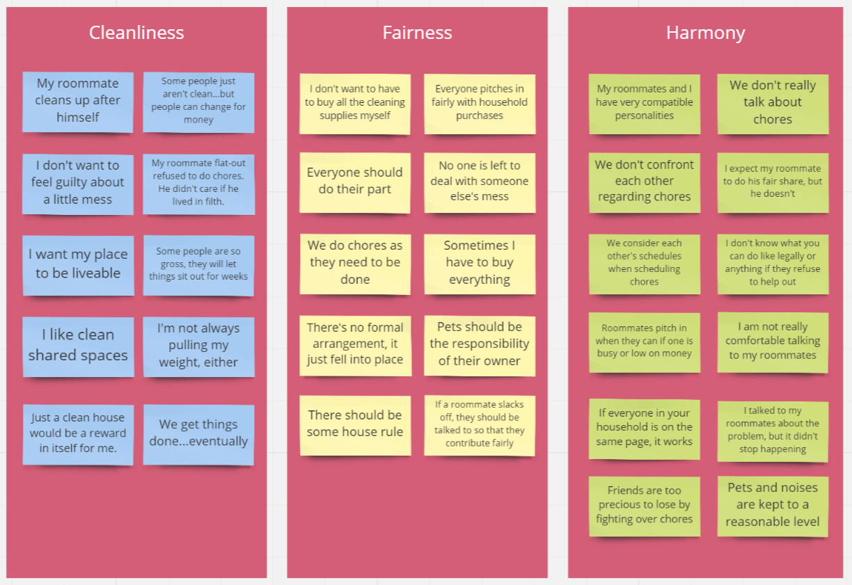
Affinity Diagram
We organized our feedback into an affinity diagram and analyzed it to find insights. We found that cleanliness, fairness, and harmony (getting along well) were the top concerns people had when living with roommates. Money also came up with regards to splitting household supplies and expenses. We thought this was an interesting secondary pain point, so we kept it in mind as a possible auxiliary feature of the app.
Define
Understanding the User
People living with roommates need to divide household tasks fairly because although they want to live in a clean house, they are hesitant to confront their roommates about equal division of chores.
We identified that users needed three main things: a clean place to live, a good relationship with their roommates, and a fair division of tasks.

User Persona

Competitor Analysis
We took a look at the current market and found that there were several chore splitting apps, but only one was targeted at roommates (and it didn’t offer incentives). We saw our opportunity to offer an app that allows roommates to divide chores and also uses rewards to motivate them to participate.

Ideate
User Flows
We prioritized features for our app and mapped them out in a user flow.
In the onboarding process, the user can either create a new household or join an existing one. The app takes new users through an interactive chore assignment quiz to determine their preferences and their household’s habits. It uses this data to equally assign chores to each roommate so the user doesn’t have to delegate.
From the Chores screen, users can see all chores and to whom they are assigned. They can also edit chores, swap chores with other roommates, and verify that chores have been completed after their roommates mark them “done.”
On the Household screen, users can view and edit details about their household. They can also add/remove roommates or reassign chores.
Users are motivated to download the app and complete their chores on time with rewards, which they can trade in through the app for discounts to popular stores. On the User Profile screen, users can access these rewards. They can also view all of their own tasks and have the ability to swap chores with their roommates.
Click through to see each user flow below:


Prototype
Storyboard
To put ourselves in the shoes of the user and understand how they might interact with our proposed app, we drew up a storyboard to illustrate a typical use case.

Sketches & Wireframes
I sketched the onboarding flow and some other essential screens. Using Adobe XD, we made wireframes and put together prototypes for user testing.


Test & Iterate
User Testing
We tested our prototype with users, paying close attention to our onboarding flow and a few fundamental features. We discovered some points of friction and confusion, which gave us guidance for future iterations.
See a video of the low fidelity prototype in action below.
Takeaways
• Add Create Profile screen so user account is not the same as the household account
• Make swapping process more streamlined
• Add chronological hierarchy on chore screen
• Don’t share progress with whole household; only track personal progress
Style Tile
As the primary UI designer for this project, I created a style tile to guide the visual design of our app. This small-scale style guide defined some of the colors, components, and typography, and was helpful in building out high-fidelity mockups of a few screens.

Iteration
I implemented the improvements we gleaned from user testing and created hi-fi mockups for certain screens, using the UI components we had designed.
User Account
Added a user account so that the user isn’t permanently attached to their household; they can use the app with different households, without losing their personal history and rewards.

Chore Swap Flow
Streamlined the chore swapping feature, minimizing the number of screens in the flow and adding animation opportunities.

Chore Task List
Iterated on the chore task screen, making the hierarchy chronological and adding color to improve usability.

UI Design Iteration
Improved the design as a whole, adding color and implementing a style guide to achieve greater cohesion across the app.

Mockups
Using the feedback from user testing and the UI style tile, I translated our lo-fi wireframes into hi-fi mockups.

High-Fidelity Prototype
I focused on the onboarding process flow and built out an animated prototype for the first few screens of the app.
See a video walkthrough of the high fidelity onboarding prototype below.
Final Thoughts
Too Many Ideas!
Something we struggled with at the beginning of this project was that we had too many ideas for features that we wanted to include in the app. With more time, we might be able to build out more features, but it is also important not to bog the user down. Feature prioritization matrices were helpful in narrowing down the things we wanted to focus on designing, and we knew that we would be able to do fewer things better than if we attempted to tackle too much.
User Flows Save Time
Although creating a detailed and complete user flow can take a lot of time up front, I found that it is essential to do so in order to save time later when designing. We iterated on our user flow, focusing in on each segment and then tying it together to create a cohesive user flow with no dead ends. This helped immensely when designing each screen; I could easily tell what I needed to create, how many screens it would take, and where it needed to connect to in the prototype.
Next Steps
For this project, we chose to focus on the user persona of a young millennial living with roommates, but through our research we found that there is a much larger group that would have use for this app. We’d love to extend the use case to families, especially families with young children who are teaching their kids responsibility. Children are highly motivated by rewards, so the infrastructure of our app would translate well to the family household.