The Problem
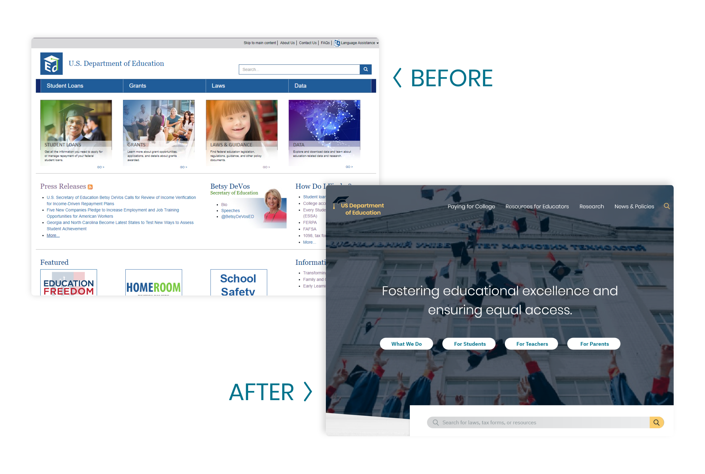
The US Department of Education is committed to providing every child with a quality education. Unfortunately, their website is outdated, unattractive, and hard to use. It is essential that the site be efficient and accessible for anyone who visits it seeking information.
Proposed Solution
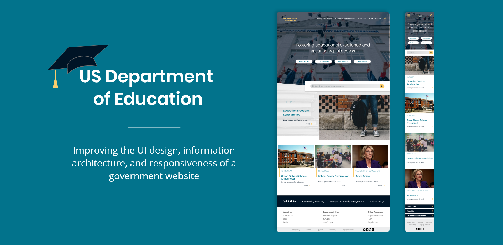
A review and analysis of the current website, as well as a complete redesign of the information architecture and user interface. My goal was to redesign the UI so that the site becomes a beautiful, easy-to-use resource that feels less like work for users.
Timeline
3 weeks (July 2019)
My Role
Lead UX/UI Designer (individual project)
Tools
Adobe XD, Invision, Trello
User Research
The US Department of Education website is an important resource for educators, parents, and especially children, but these users don’t gain any benefit from a website that is difficult to use. If the users can’t find or access the information they need, they can get frustrated or even miss opportunities for learning about educational resources and funding.
I analyzed and annotated the following pages from the website: Home, About, 1098 & Tax Forms, Every Student Succeeds Act, Betsy DeVos, Press Releases, Student Loans & Forgiveness.
User Interviews
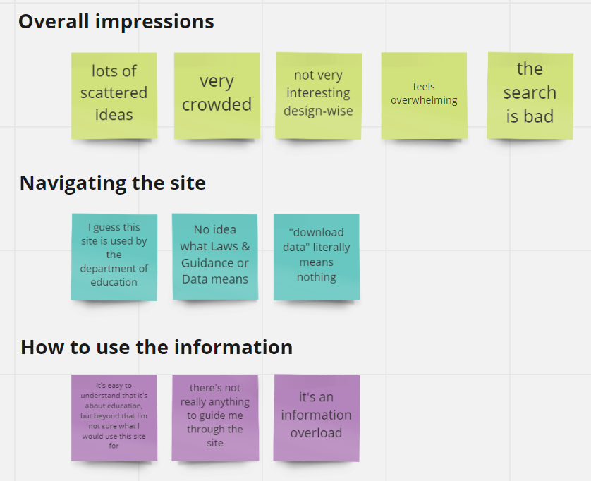
I also interviewed a few users to get a sense of how different people interact with the site. My own site analysis, coupled with this user research, led to the following insights:
The site is resource-heavy but lacks an intuitive information architecture for users to find what they need. The search bar provides no suggestions or help for those who aren’t sure what they should search for. The alternative is to browse the homepage to find the correct information. Unfortunately, the homepage is covered with text that is mostly the same size and color. This lack of hierarchy and readability makes it very difficult for users to navigate the site.
Aside from the poor information architecture, the Dept of Education website is ultimately dated and has a “boring government” look and feel. I wanted to redesign this site to make it a more useful and delightful resource for the educators, parents, and young minds it strives to help. Government websites often have the reputation of being old, dull, and no-frills, but that doesn’t mean they have to be depressing or unusable.
With these initial findings in hand, I organized my thoughts in an affinity diagram and created user personas.
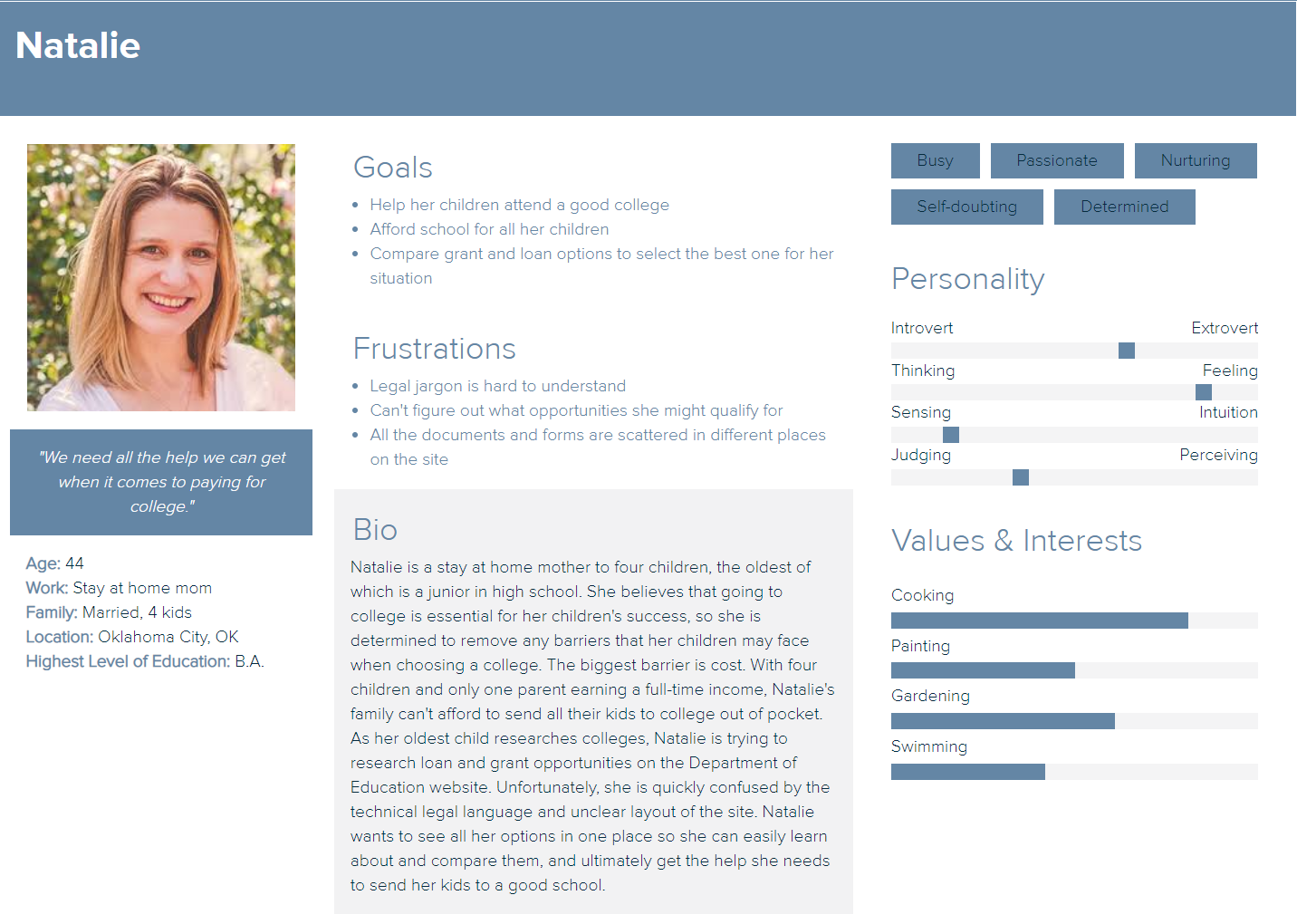
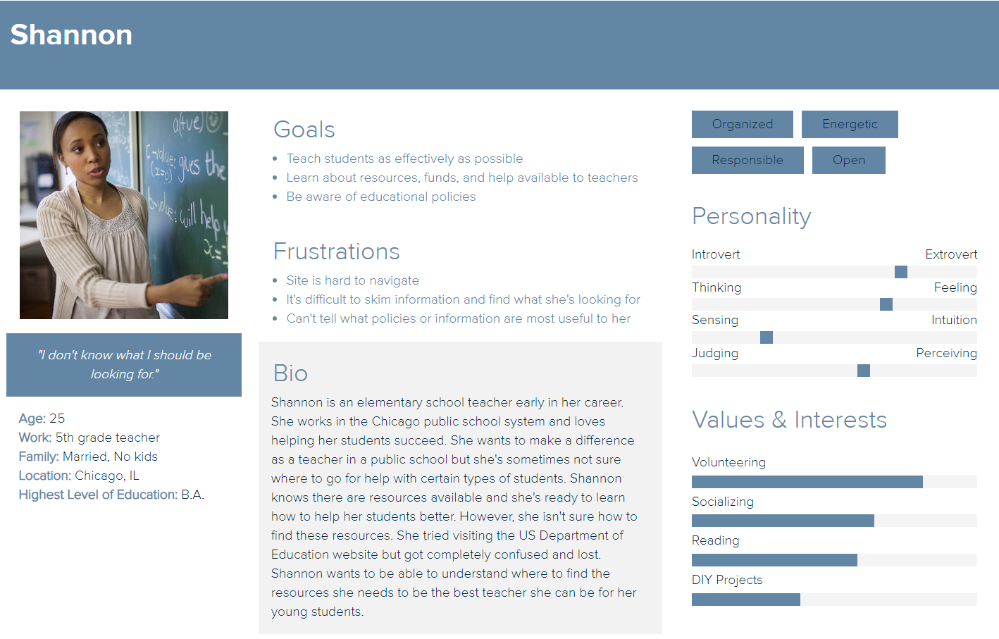
User Personas
I made two user personas to represent the two main types of users that would be navigating the Dept of Education website: a teacher and a parent. These user personas helped me reflect on the needs and challenges of the user, in order to ideate possible solutions for redesigning the information architecture.
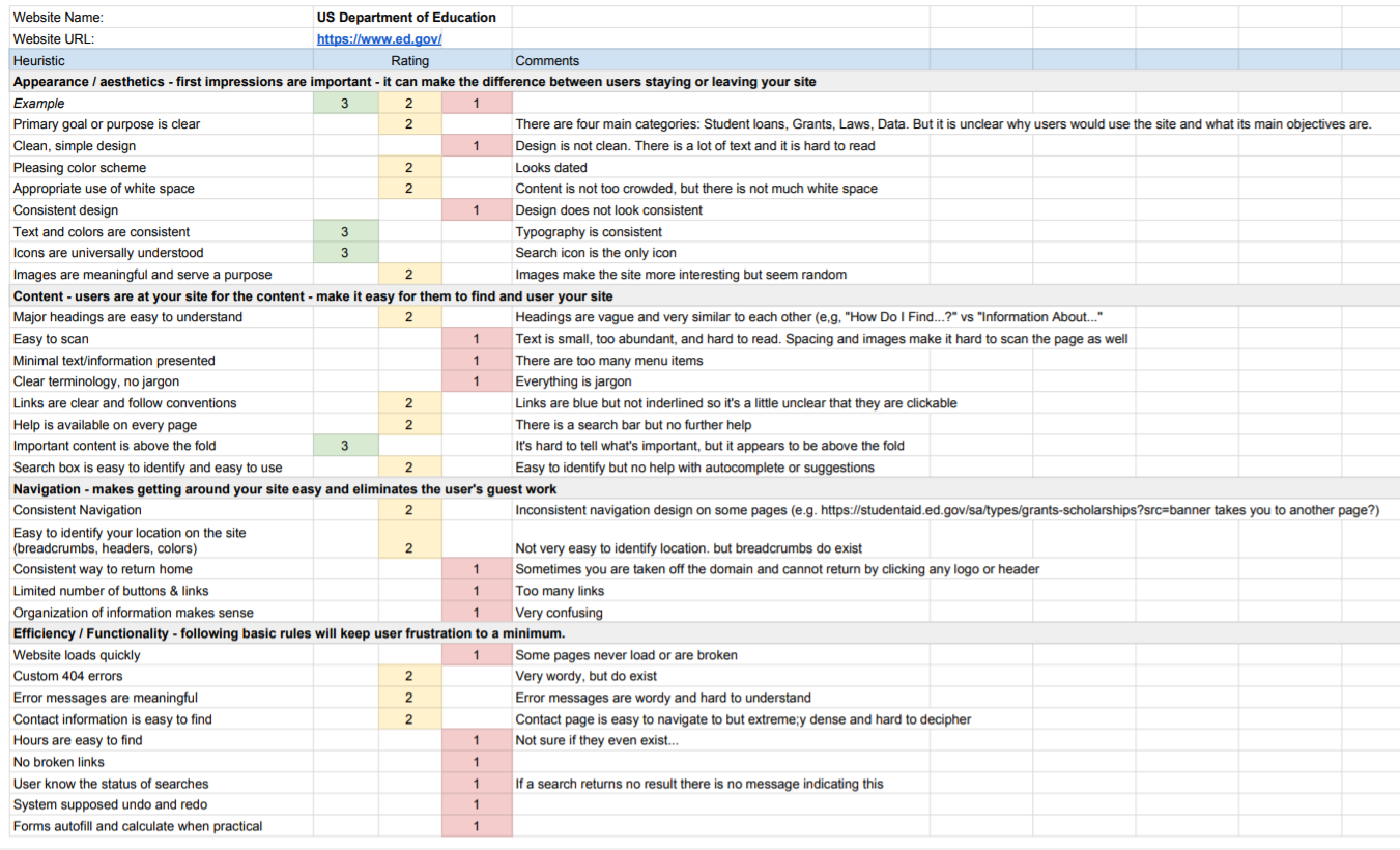
Heuristic Evaluation
Looking more closely at the existing website with my users in mind, I performed a heuristic evaluation and did a task analysis of the search process. Overall, the site was not intuitive to use and looked dated. Upon closer inspection, I found that the menu was confusing and the only way to know what a link meant was to click on it, thereby navigating to your destination through trial and error. The site was very text-heavy and hierarchy was not clear. There were several sections of links on the page, but with no indication of where the user should look first or how they should use the page. I kept these insights in mind when thinking about how to redesign the navigation and site structure.
Ideation
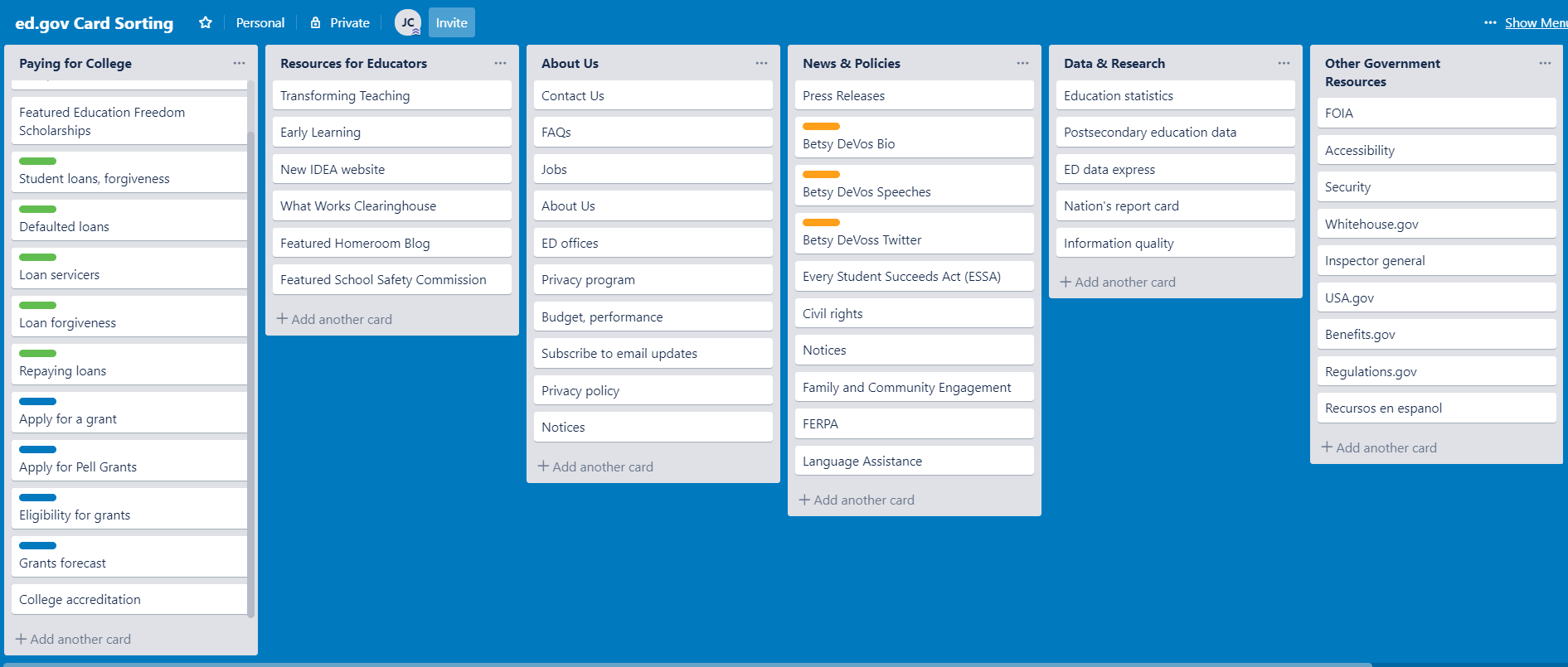
IA Card Sorting
The existing website had a lot of links in disjointed sections and menus, so I used card sorting to reorganize the links in a more intuitive way.
Many of the headers had unclear titles, making it hard to predict what could be found in each menu item. Using Trello, I sectioned all 53 links into six main categories and renamed them using more user-friendly language. I predicted that certain categories would have more traffic than others, so the next step was to lay out the site and make sure all the information could be displayed in a clear and simple way.
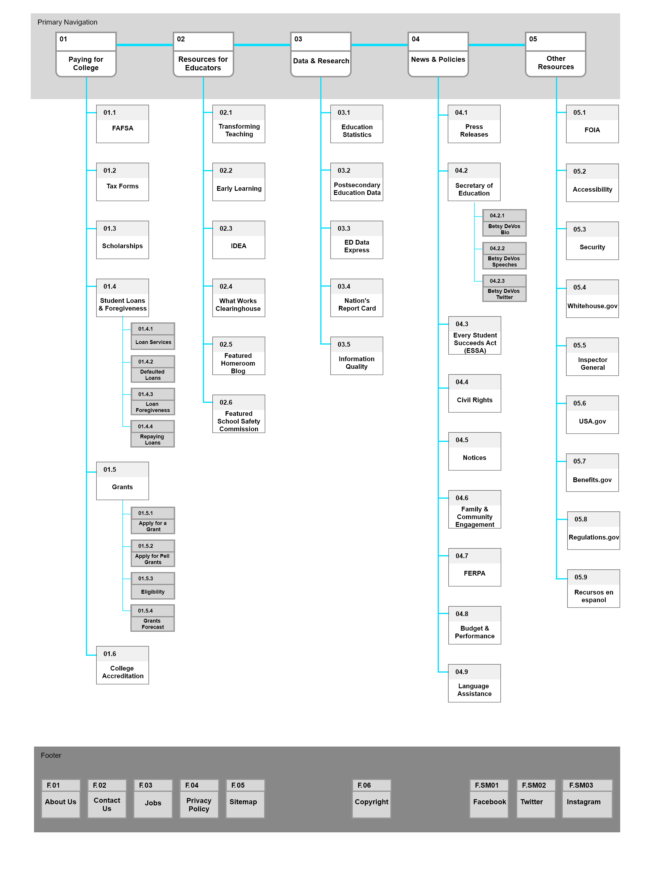
Sitemap
Using the organizational system developed in the card sorting exercise, I laid out a new sitemap.
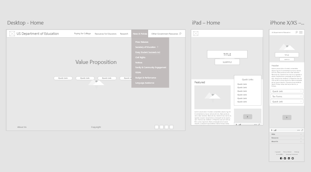
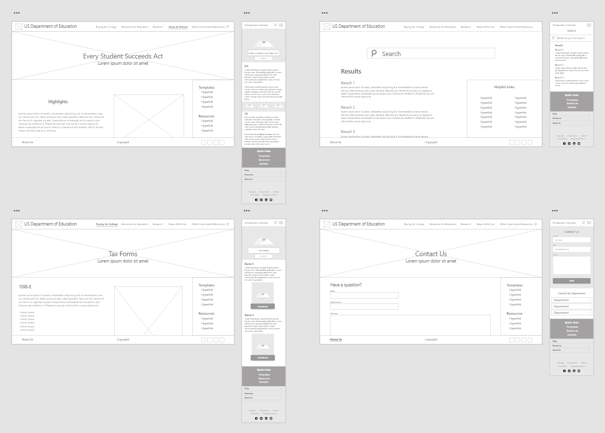
Sketches & Wireframes
Next, I sketched out a few screens I wanted to redesign. Using a mobile-first approach, I translated the sketches into wireframes on Adobe XD and created a prototype to test.
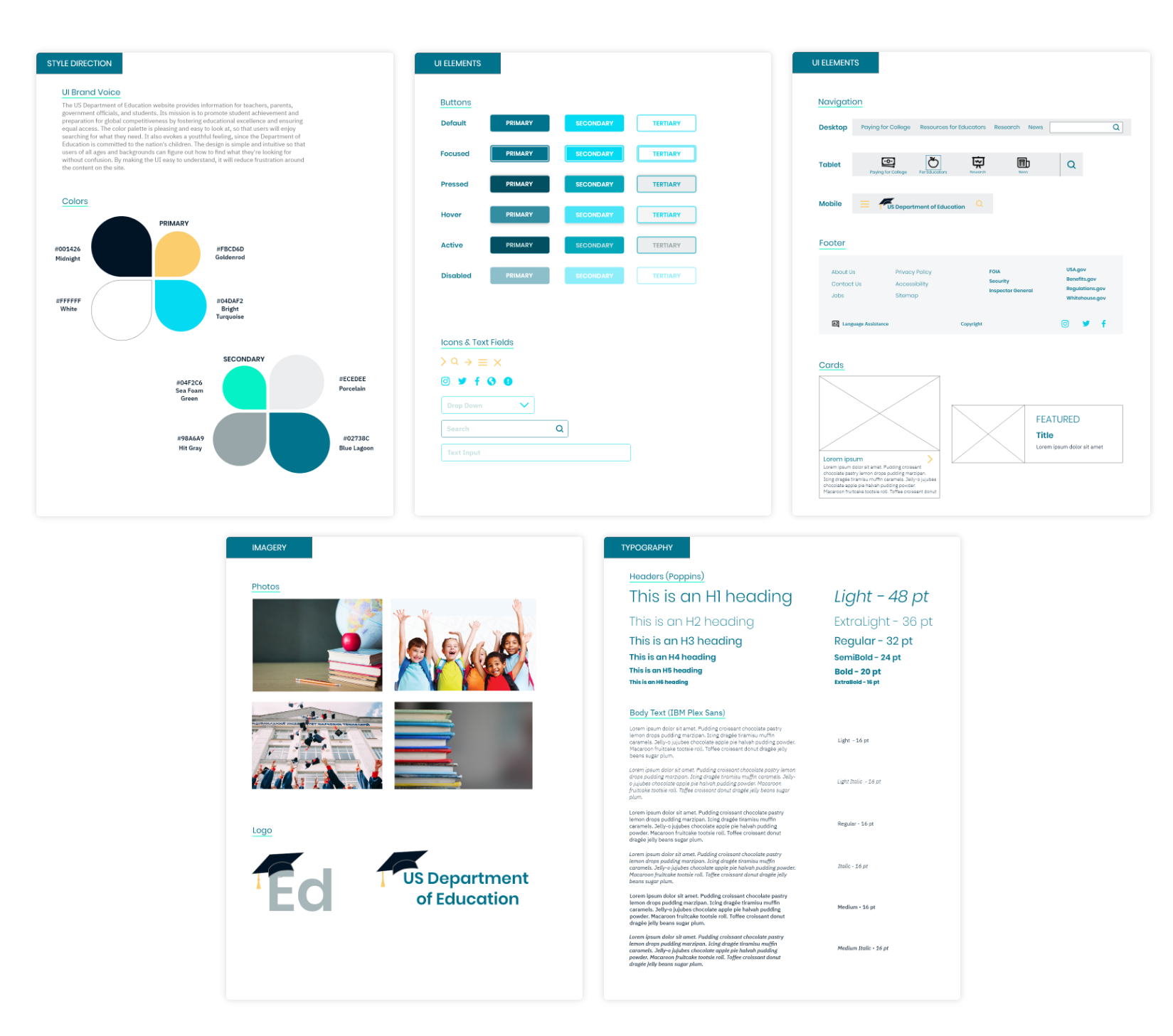
Style Guide
I identified the brand voice of the Department of Education and created a style guide to direct my UI design decisions.
I chose a color palette that is pleasing and easy to look at, so that users will enjoy searching for what they need, despite preconceived feelings of frustration that they may have. It also evokes a youthful feeling, since the Department of Education is committed to the nation's children. The design is simple and intuitive so that users of all ages and backgrounds can find what they're looking for without confusion.
Prototyping
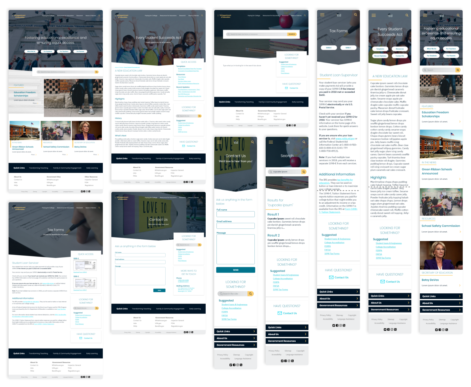
Responsive Mockups
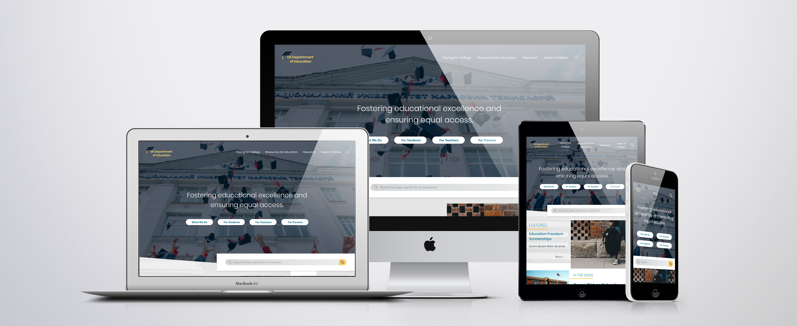
Using my style guide, I translated my wireframes into high-fidelity mockups. I made the designs responsive for tablet and mobile, which was something the original design lacked.
User Testing
I tested my prototype with 5 users and compiled some actionable design changes from the feedback I received. The responses were generally positive, with a few suggested changes. The tasks I had them complete and the key takeaways are as follows.
Tasks
1. First impressions of homepage
2. Perform a search
3. Find information about the Every Student Succeeds Act
4. Find and download the 1098-E tax form
5. Contact the Department of Education
Takeaways
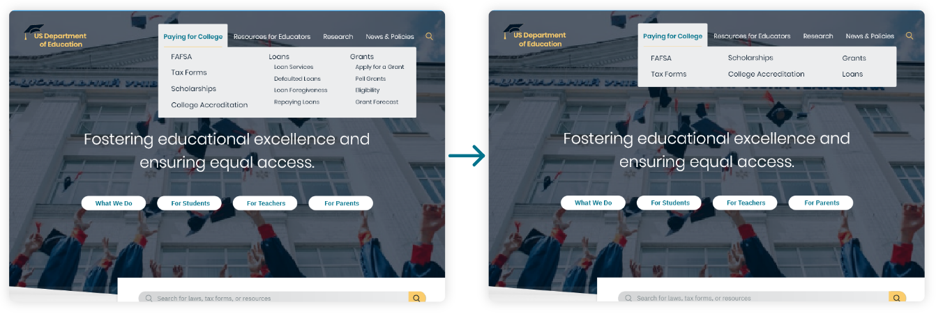
1. Secondary menus (Loans, Grants) can be simplified to main header because everything can be found on one page
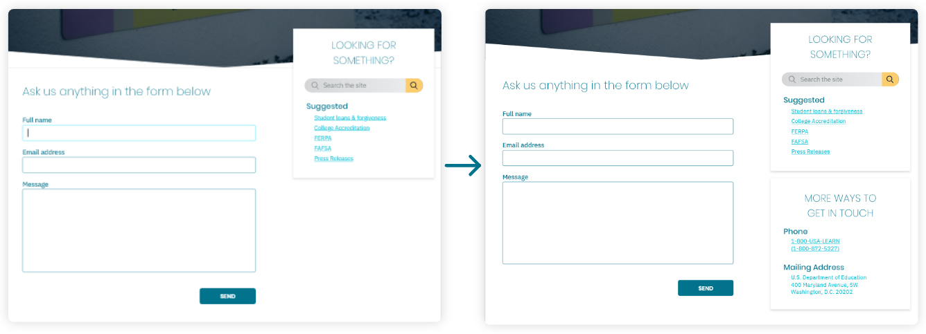
2. Add card with phone numbers, addresses to Contact Us page
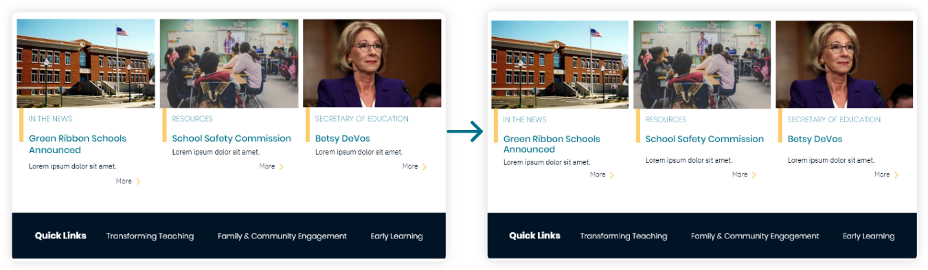
3. Align “More” buttons at bottom of homepage
Iteration
I iterated on my mockups, taking into account the results from my user testing and making changes where necessary.
Simplifying the Menu
I took out some of the secondary menus (such as those under Loans and Grants) because the items found under those headers could actually all be found on one page, therefore did not need to be separate menu items.
Adding Contact Card
I added a card to the Contact Us page that had phone numbers and office addresses so that users could contact the department in other ways.
Aligning Components
I aligned the “More” buttons under the cards at the bottom of the homepage, and realigned the footer so the hierarchy was clearer.
Hi-Fidelity Walkthroughs
Hi-Fi Desktop Walkthrough
Hi-Fi Mobile Walkthrough
Final Thoughts
The Importance of Navigation
After trudging through the immense number of links and menus on the DoEd website, it was clear that a navigation redesign had to be a priority. The existing hierarchies were hard to understand, and the users I interviewed had a hard time finding things or knowing where to start. After card sorting and mapping out new navigation, I was able to find a less confusing way to display all the information so that users could easily find what they were looking for.
Responsive is Key
The current Department of Education site is ugly on desktop, but almost unusable on mobile. In a time when almost every adult owns a smart phone and internet traffic is increasingly mobile-heavy, it is imperative that all sites are responsive. I made sure my design translated to mobile easily and intuitively, and created a few iPad screens as well. I also made sure to test these designs on the proper-sized screens to check font and button sizes.